|
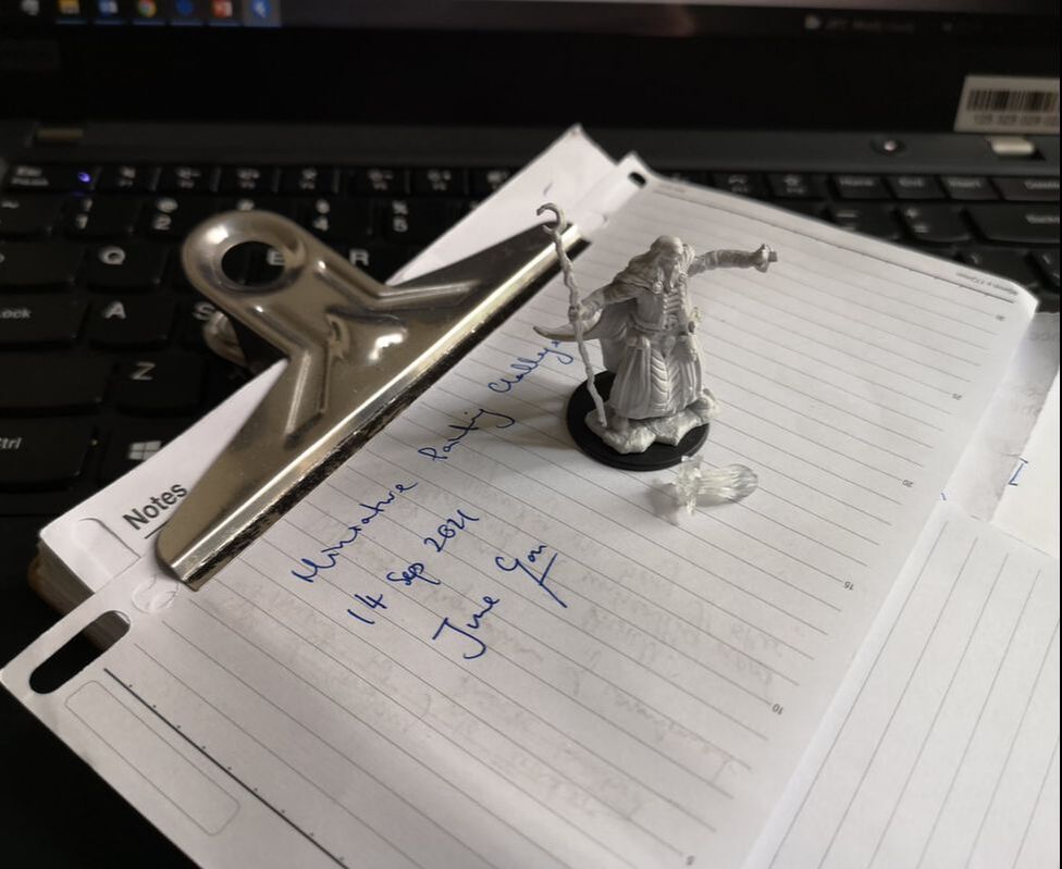
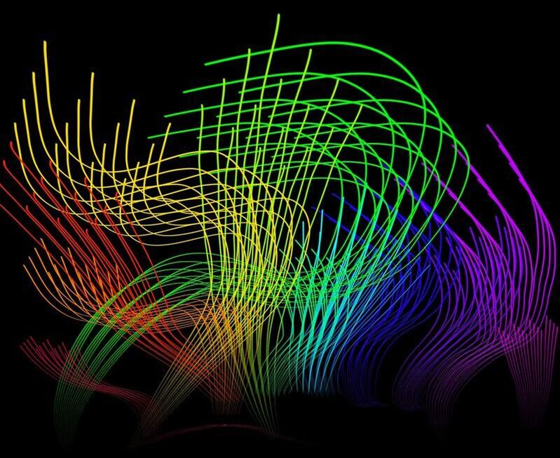
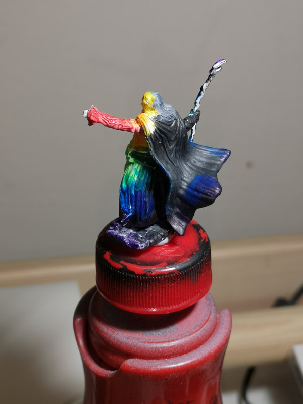
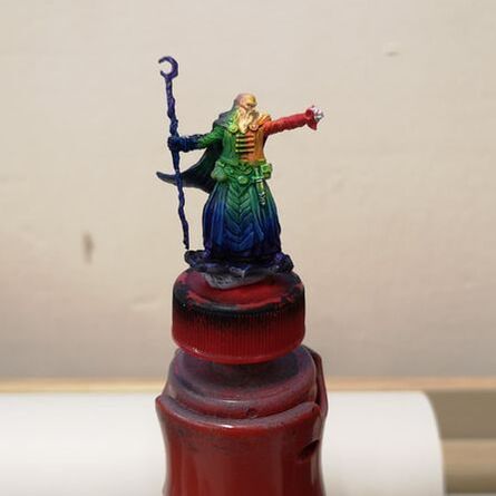
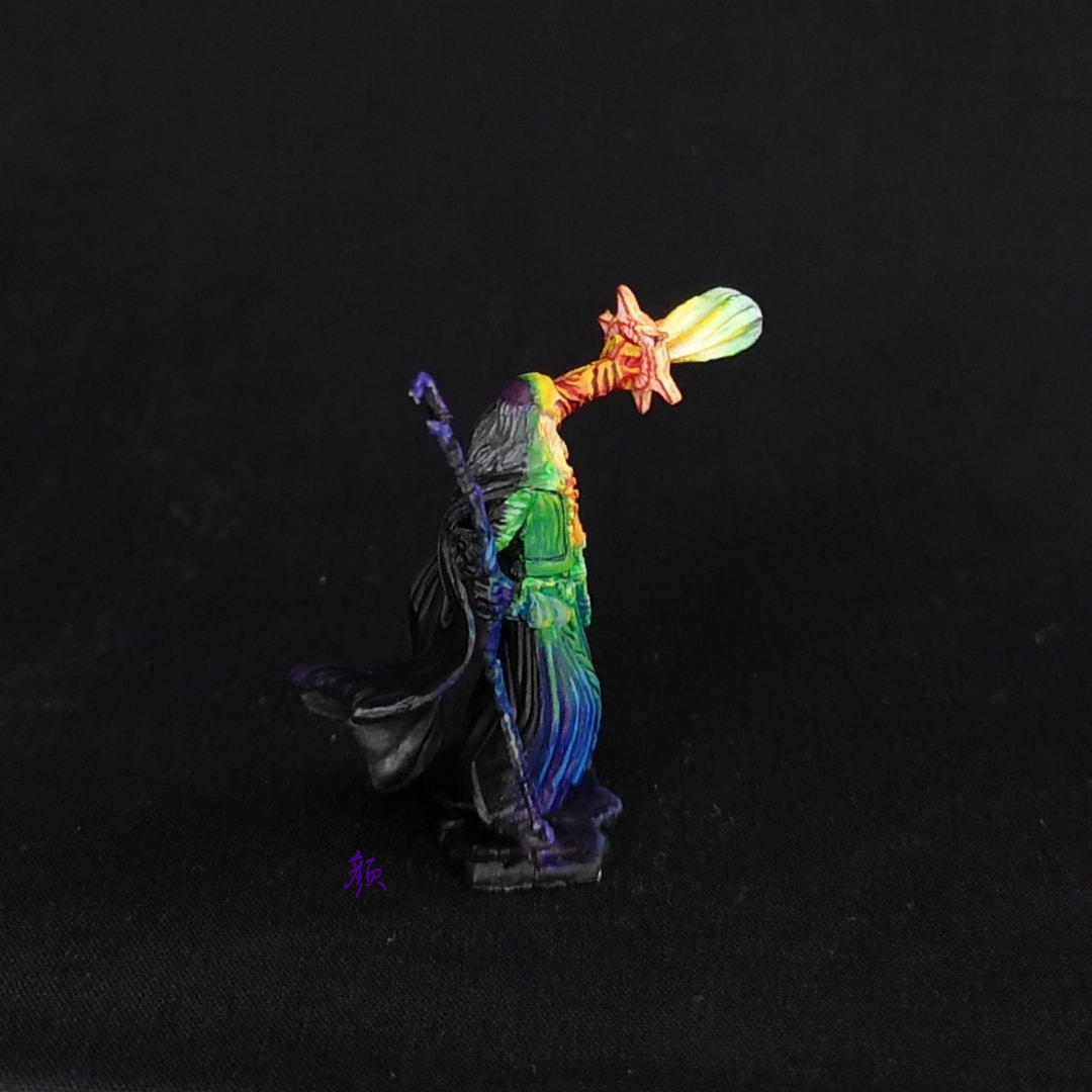
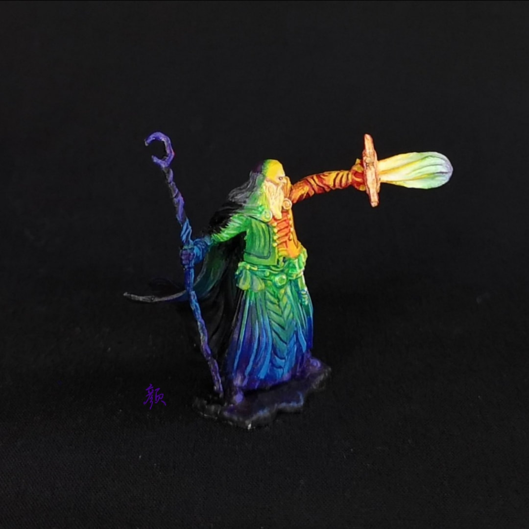
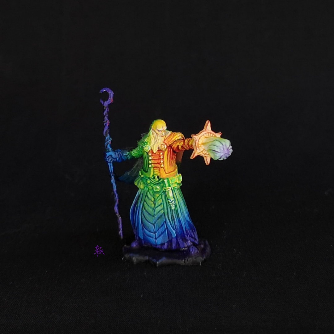
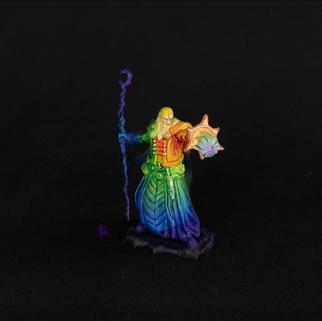
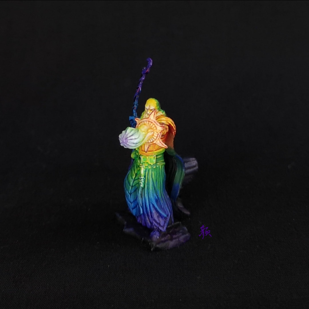
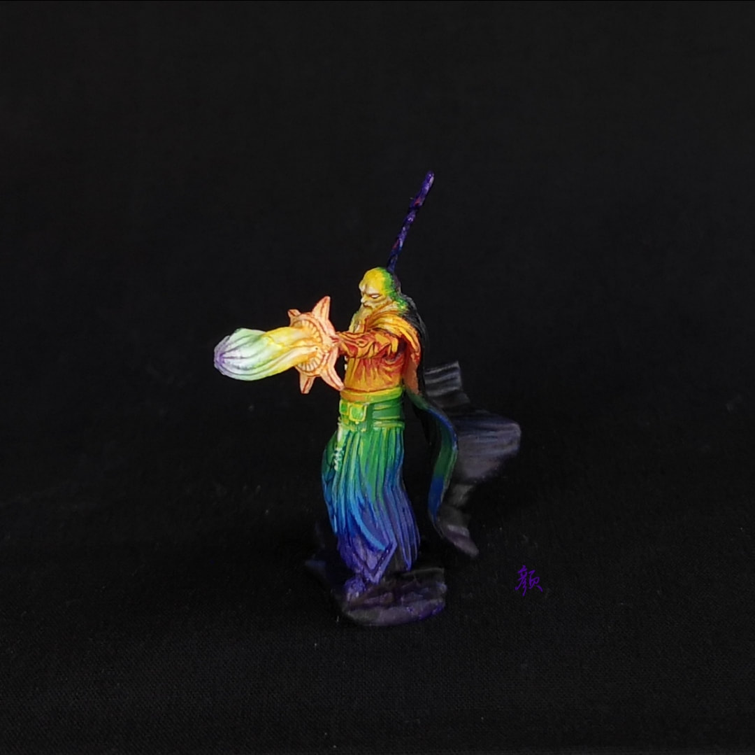
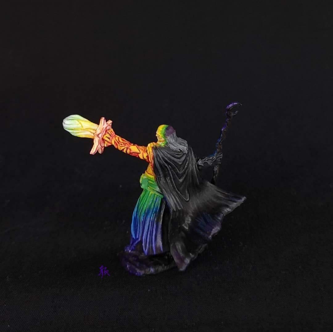
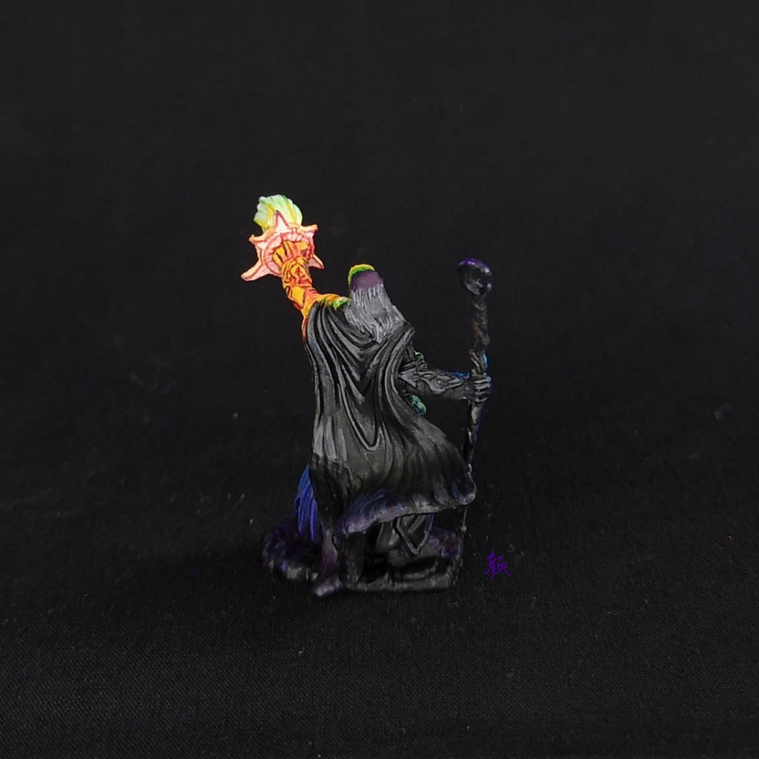
I entered a competition for the very first time in September! Frontier Wargaming was running a competition for one of their beautiful painting cases, and this was fantastic motivation to clear something from my ever-growing grey pile. I didn't set my hopes very high from the beginning, but after browsing through the case and all its add-ons, I really started to want it! The premise of the competition was to paint a miniature using a palette based on a photo. Participants would then pick colours found only in the photo, and use those to paint the miniature. They had linked to a few stock photo websites, and I chose this photo below (Mahadevu Udaya Bhaskar).
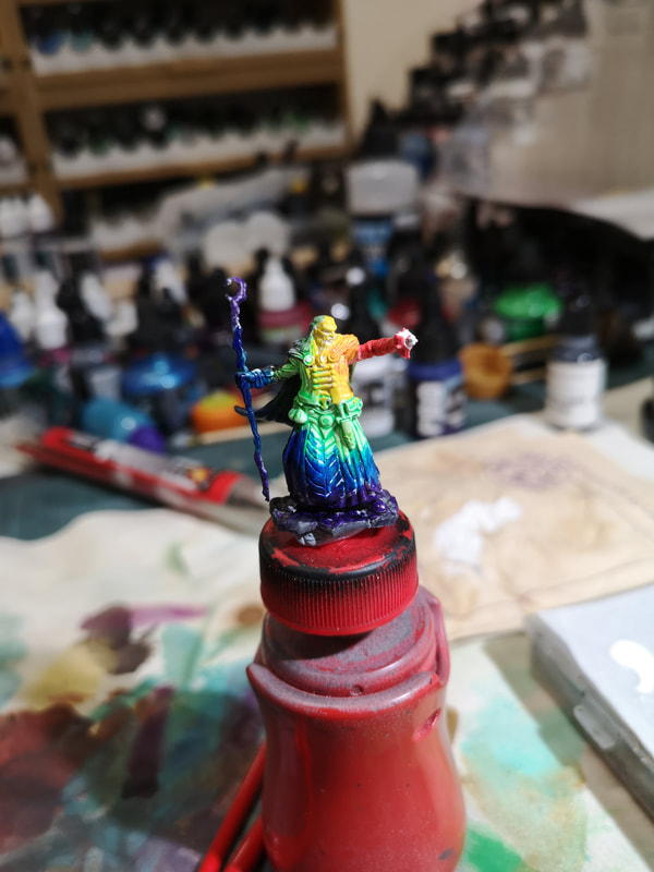
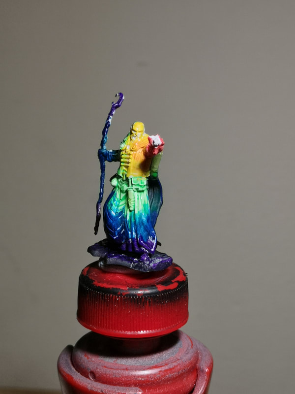
The photo reminded me of the Windows Media Player rainbow visualiser that pulsed and warped in sync with the music. I was also inspired by a project a friend was working on - he was painting up a figure divided up into three concentric circles, with each section being a different colour. I dug a wizard out of my grey pile, and submitted my entry. My initial idea was doing something like strobe lights, but I had difficulty finding any good reference pictures to get a reasonable idea of how to execute it. So I settled instead on the premise of the wizard shrouded in complete darkness, casting a prismatic spell. The process of identifying colours was a little bit trial and error, but I ended up going with Pro Acryl Bold Titanium White, Vallejo Nocturna Inferno Red, Pro Acryl Orange, Citadel Flash Gitz Yellow/P3 Cygnus Yellow, P3 Necrotite Green, P3 Iosan Green, Pro Acryl Transparent Blue, Pro Acryl Transparent Purple, P3 Thamar Black. A friend later suggested a very clever idea - to find the hexadecimal of the colours in the picture and cross-reference them on a database of paints - but unfortunately by the time I'd heard that, I was halfway through painting! I did an initial sketch of the areas where each colour would fall (and to check that my idea wasn't totally insane!). I had not planned this piece well - I was in the middle of moving house during this time, so I knew I was tight on time, and the deadline for submitting the finished piece was on 31 October. But after the first few hours of sketching out the areas of light, eyeballing the values, and refining the colours according to the stock photo, I was a lot less stressed. The biggest takeaway from this step was that I couldn't use the yellow as a section by itself. The value was too high (read: it's was too bright), so I decided to keep that as the highlight colour instead. This stage was also a great way to get used to working with the Pro Acryls, since this was my first big exposure to them. I have to say, I absolutely love their saturation. In fact, I went out the next day and bought myself a bunch from Game State. I'll be more to my collection over time.
It also dawned on me closer to the end, that the shadows closer to the spell effect would have to be much much harsher than I'd previously painted up. I ended up lining the shadows on the hand with Pro Acryl Transparent Purple (the darkest colour on the mini apart from black), and this was next to the P3 Cygnus Yellow, creating very dramatic, harsh shadows. After all of that came a little bit of waiting for the results of the competition to emerge. There was a tense round of community voting, followed by a private judging by the Frontier Wargaming panel. After a couple of weeks of trying not to get my hopes up, I received a happy message notifying me that this piece had won, and that my new painting case was on the way. I owe a huge round of thanks to my friend from Geekified for getting me through this little project. She's a fantastic friend and mentor, as well as a painter, printer, and retailer of geeky things. She's helped me to level up my painting so much, and I would not have been able to knock this wizard out so quickly without her 💛 she does painting streams and classes with Neo Tokyo Project every so often, so go hang out! If you enjoyed the article, please do consider donating your spare change on my Linktree https://linktr.ee/junebug.minis. It helps fund my art with supplies, new minis, and upskilling. Thanks for visiting, and enjoy the art!
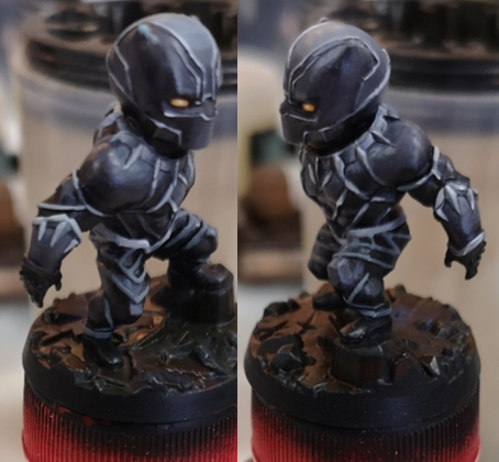
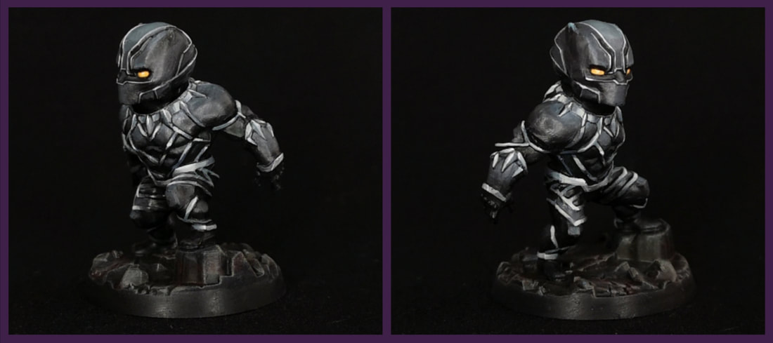 Black Panther was a challenge for me, as it was basically an exercise on how to paint different textures without being able to use colour.
Well, that's not entirely true. I'd attempted NMM before and while the minis still looked good, one couldn't really call that technique NMM. I would say that those areas still looked nicely painted, but when juxtaposed with (my attempt at) TMM, it felt a bit jarring. Maybe that's not entirely true, I think the armour on the dragons is passable, but in any case, I think I'd count Black Panther as "properly executed" NMM. 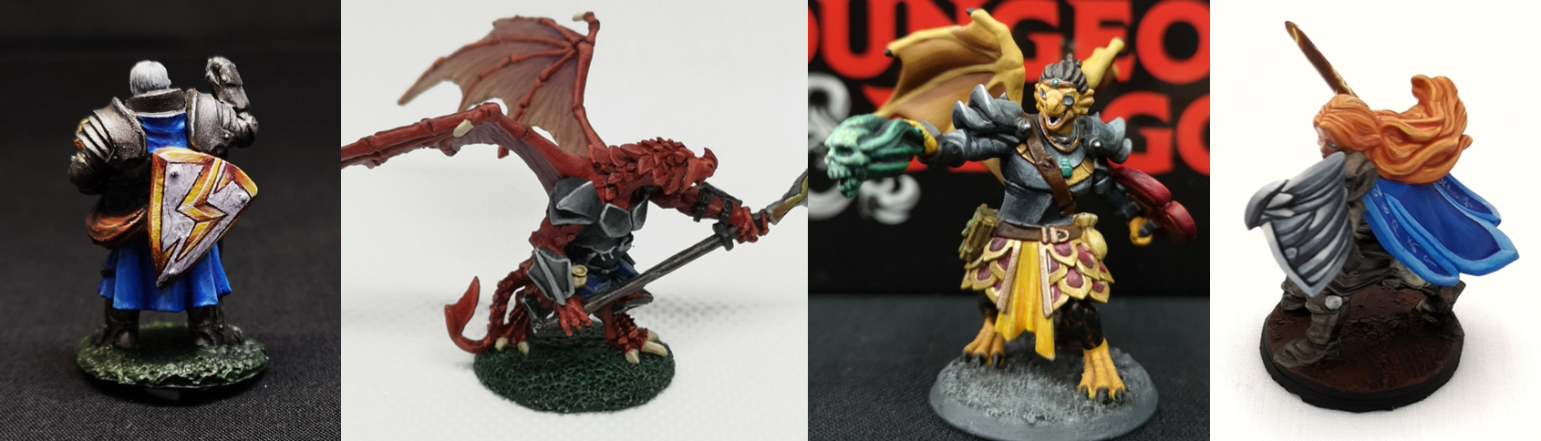 (Left to Right): Reaper (77197) Erick; Reaper (03473) Khesh Blackscale; Hero Forge Aun Tyr; Hero Forge Zonaryl (aasimar). I'm jumping a little ahead of myself. I primed BP black to start with, and I decided that since his armour was more matte than shiny metal, I would only highlight as far as a dark-ish kind of midtone. This stage went fairly quickly. I think the biggest "problem" I had here was making the blend on his head smooth, but the creamy P3 paints made that quite possible. For the base, I'd just seen a tutorial on coloured stone by a fellow painter and took some inspiration from it. I purposefully left the base very dark, as I didn't want to diminish attention on the main figure, but I used up some leftover reds, blues, and greens from my wet palette and added a little bit of variation to the stones. Finished off the base with a gentle drybrush of dark-ish grey, just to make the texture stand out a little. Moving on to the meat of the mini, I tried my best to refer to the box art by Bigchild Creatives's Hugo Gómez Briones. It helped a lot in trying to figure out where to place the reflections, but only pictures of the front were available, not the back. I also bought myself a couple of warmer greys from my FLGS, so the greys in the metal would look subtly different from the greys in the armour. I started off with his necklace, as I thought if I could get that done first, the rest of it would come more easily.
Another big learning point was how to not blend. I love blending. I absolutely love blending. If you look at Zonaryl's wing shield, all the individual "feathers" are blended nicely and smoothly, and that's the way I like it. But working on this kind of absolutely miniscule surface area, it was impossible to have such a smooth gradient and illustrate the contrast I needed to in order to sell it as metal. One of my struggles with this part was powering through the "meh", cringe-worthy phase. I knew it would look good once it was done, so I had to put aside my tripping up over the "meh" looking bits to work on the next stage of painting. I was dumbfounded by how simple the process actually was, and let out a string of excited profanities, much to the amusement of my painting companions. A friend later pointed out that it was cool how the armour greys were slightly cooler than the metal greys, and that there was a nice balance between the warm yellow eyes and bits of red in the base. I appreciated that he recognised the former (it means that my idea worked!), but the latter of these points were quite intentional. If you enjoyed the article, please do consider donating your spare change on my Linktree https://linktr.ee/junebug.minis. It helps fund my art with supplies, new minis, and upskilling. Thanks for visiting, and enjoy the art!
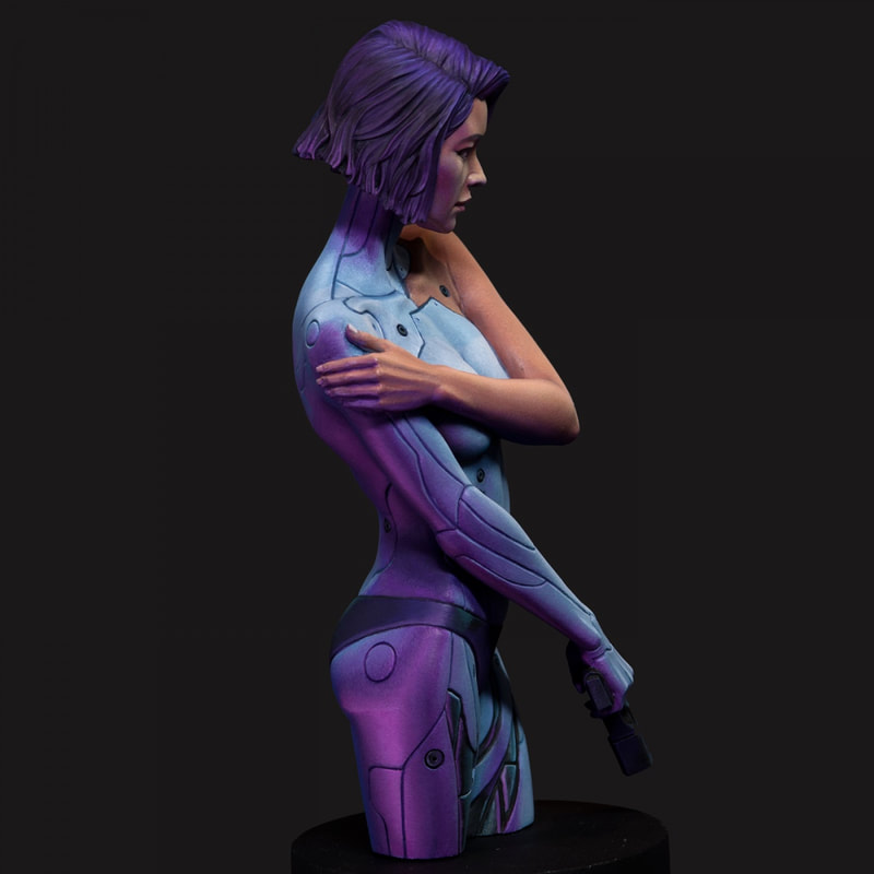
A fellow painter was giving me feedback on a WIP the other day, and he mentioned that the highlights were the colour of light, and the shadows were the colour of the environment. At the time, it kiiiiiiiind of made sense, but the more I thought about it, the more I realised that it had the potential to elevate my painting to another level. I needed to start thinking about the figure not as an isolated "portrait," but as a whole piece of art. Highlights are the colour of light, shadows are the colour of the environment. This statement made me think about something cool I'd noticed several months ago, whilst on my way to the game shop where I paint. One of the crossings has lights on the floor of the pavement, to let pedestrians with their noses in their phones know when to cross. These lights are actually really strong, so much so that they lit up the underneath of the leaves of the trees above us. Holding my hand out, I noticed how, where the shadows would normally just be a darker gradient of skin tone, they were a vivid red. In the areas that would be darkest, the red was brightest, as if coming from another light source. On the side of my hand, at the transition between shadow and light, the "shadow" was instead red light. And as soon as I'd noticed it, I was snapped back to reality by the red light turning green.
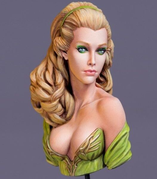
This is certainly a very strong example, but the principle applies even when there isn't a specific light source in the environment. Mere proximity to a coloured surface will tint your shadows, the effect will just be much less obvious because it's not directly from a light source, but reflected off the coloured surface. On small minis, this is almost negligible because it's simply not visible to most people, and usually not worth the effort unless you want to achieve competition level. But on larger minis and on dioramas, accounting for environmental light is much more important. Different materials also reflect light in different ways. Skin is matte and has very smooth gradients, and you can smoothly blend in the highlights and shadows. In contrast, metal is much more reflective, and the transitions between light and dark will be sharper. Metal will also reflect environmental colours more strongly than skin. In the example above, the purple on her right thigh is stronger than on her left hand, partly because her hand is further away, but also because skin is less reflective. I suppose that this also clarifies the thought process around object source lighting (OSL). It's easy to place highlights from above, because we're all used to observing lighting from the Sun. But the source of your light is coming from an object, the "highlights" will be placed differently, and the colour of that light will be stronger because it is in closer proximity.
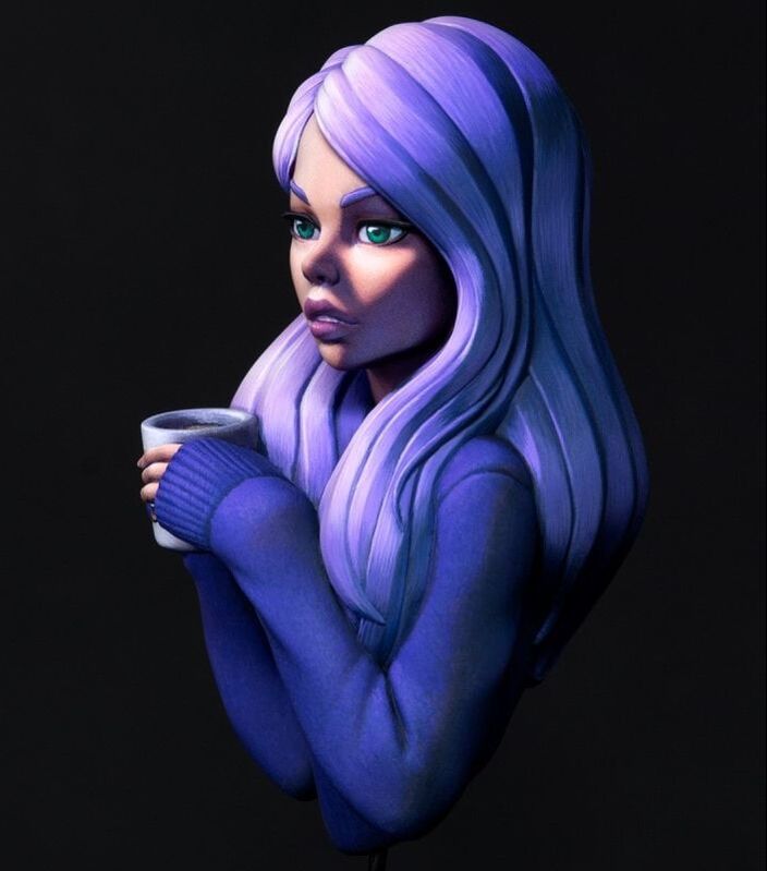
The last point that struck me about his quote was to do with spotlights. Esthel on the left is a beautiful, entirely-lit portrait. The colours of her skin are fairly consistent because the lighting doesn't change. In contrast, Cozy on the right is spotlit. Her face is towards the light and her back is in shadow. We know she is light-skinned, but the colours used are just skin tone, they are two gradients - skin tones and blues. The spotlight helps to draw attention to her face, creating a focal point, and adding a little bit more drama to the scene. (Is it obvious that I'm a Dave fan yet?) In conclusion, thinking about light in different ways - direction, intensity, colour, spotlights, environmental and ambient light - helps to create an overall scene and tell a story. It'll take a lot of practice, but I'm glad I recognise these as concepts to think about and hopefully incorporate soon. If you enjoyed the article, please do consider donating your spare change on my Linktree https://linktr.ee/junebug.minis. It helps fund my art with supplies, new minis, and upskilling. Thanks for visiting, and enjoy the art!
|