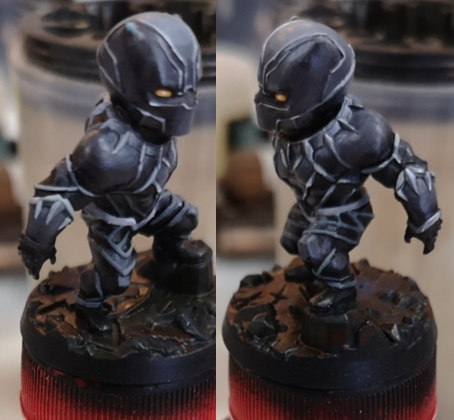
 Black Panther was a challenge for me, as it was basically an exercise on how to paint different textures without being able to use colour.
Well, that's not entirely true. I'd attempted NMM before and while the minis still looked good, one couldn't really call that technique NMM. I would say that those areas still looked nicely painted, but when juxtaposed with (my attempt at) TMM, it felt a bit jarring. Maybe that's not entirely true, I think the armour on the dragons is passable, but in any case, I think I'd count Black Panther as "properly executed" NMM.  (Left to Right): Reaper (77197) Erick; Reaper (03473) Khesh Blackscale; Hero Forge Aun Tyr; Hero Forge Zonaryl (aasimar). I'm jumping a little ahead of myself. I primed BP black to start with, and I decided that since his armour was more matte than shiny metal, I would only highlight as far as a dark-ish kind of midtone. This stage went fairly quickly. I think the biggest "problem" I had here was making the blend on his head smooth, but the creamy P3 paints made that quite possible. For the base, I'd just seen a tutorial on coloured stone by a fellow painter and took some inspiration from it. I purposefully left the base very dark, as I didn't want to diminish attention on the main figure, but I used up some leftover reds, blues, and greens from my wet palette and added a little bit of variation to the stones. Finished off the base with a gentle drybrush of dark-ish grey, just to make the texture stand out a little. Moving on to the meat of the mini, I tried my best to refer to the box art by Bigchild Creatives's Hugo Gómez Briones. It helped a lot in trying to figure out where to place the reflections, but only pictures of the front were available, not the back. I also bought myself a couple of warmer greys from my FLGS, so the greys in the metal would look subtly different from the greys in the armour. I started off with his necklace, as I thought if I could get that done first, the rest of it would come more easily.
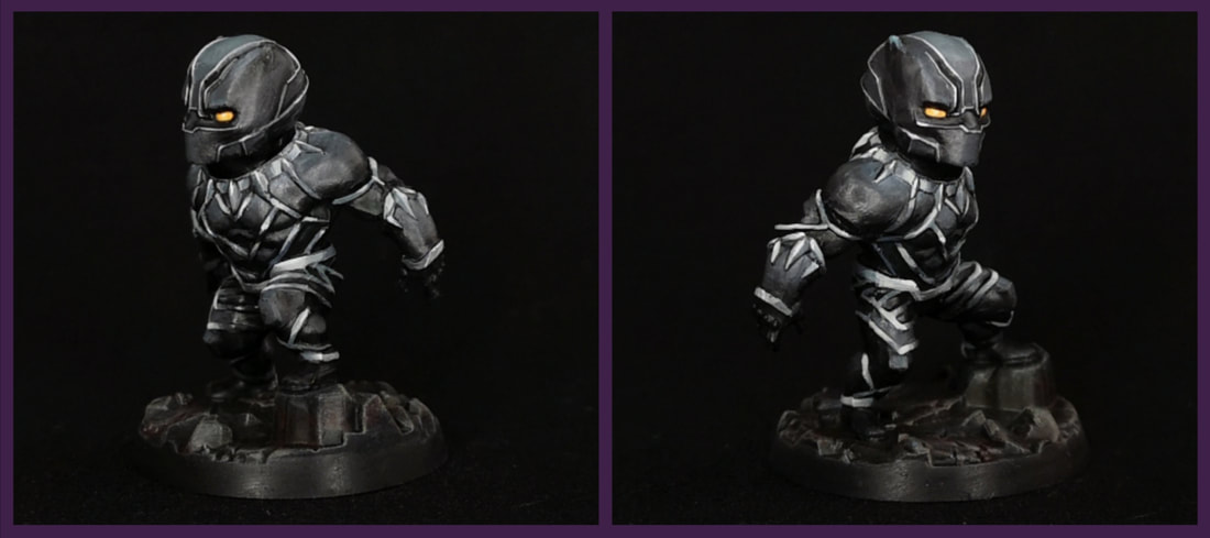
Another big learning point was how to not blend. I love blending. I absolutely love blending. If you look at Zonaryl's wing shield, all the individual "feathers" are blended nicely and smoothly, and that's the way I like it. But working on this kind of absolutely miniscule surface area, it was impossible to have such a smooth gradient and illustrate the contrast I needed to in order to sell it as metal. One of my struggles with this part was powering through the "meh", cringe-worthy phase. I knew it would look good once it was done, so I had to put aside my tripping up over the "meh" looking bits to work on the next stage of painting. I was dumbfounded by how simple the process actually was, and let out a string of excited profanities, much to the amusement of my painting companions. A friend later pointed out that it was cool how the armour greys were slightly cooler than the metal greys, and that there was a nice balance between the warm yellow eyes and bits of red in the base. I appreciated that he recognised the former (it means that my idea worked!), but the latter of these points were quite intentional. If you enjoyed the article, please do consider donating your spare change on my Linktree https://linktr.ee/junebug.minis. It helps fund my art with supplies, new minis, and upskilling. Thanks for visiting, and enjoy the art!
|