|
A fellow painter was giving me feedback on a WIP the other day, and he mentioned that the highlights were the colour of light, and the shadows were the colour of the environment. At the time, it kiiiiiiiind of made sense, but the more I thought about it, the more I realised that it had the potential to elevate my painting to another level. I needed to start thinking about the figure not as an isolated "portrait," but as a whole piece of art. Highlights are the colour of light, shadows are the colour of the environment. This statement made me think about something cool I'd noticed several months ago, whilst on my way to the game shop where I paint. One of the crossings has lights on the floor of the pavement, to let pedestrians with their noses in their phones know when to cross. These lights are actually really strong, so much so that they lit up the underneath of the leaves of the trees above us. Holding my hand out, I noticed how, where the shadows would normally just be a darker gradient of skin tone, they were a vivid red. In the areas that would be darkest, the red was brightest, as if coming from another light source. On the side of my hand, at the transition between shadow and light, the "shadow" was instead red light. And as soon as I'd noticed it, I was snapped back to reality by the red light turning green.
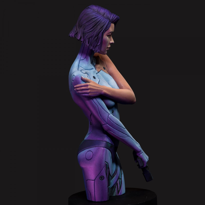
This is certainly a very strong example, but the principle applies even when there isn't a specific light source in the environment. Mere proximity to a coloured surface will tint your shadows, the effect will just be much less obvious because it's not directly from a light source, but reflected off the coloured surface. On small minis, this is almost negligible because it's simply not visible to most people, and usually not worth the effort unless you want to achieve competition level. But on larger minis and on dioramas, accounting for environmental light is much more important. Different materials also reflect light in different ways. Skin is matte and has very smooth gradients, and you can smoothly blend in the highlights and shadows. In contrast, metal is much more reflective, and the transitions between light and dark will be sharper. Metal will also reflect environmental colours more strongly than skin. In the example above, the purple on her right thigh is stronger than on her left hand, partly because her hand is further away, but also because skin is less reflective. I suppose that this also clarifies the thought process around object source lighting (OSL). It's easy to place highlights from above, because we're all used to observing lighting from the Sun. But the source of your light is coming from an object, the "highlights" will be placed differently, and the colour of that light will be stronger because it is in closer proximity.
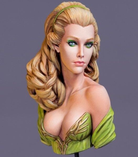
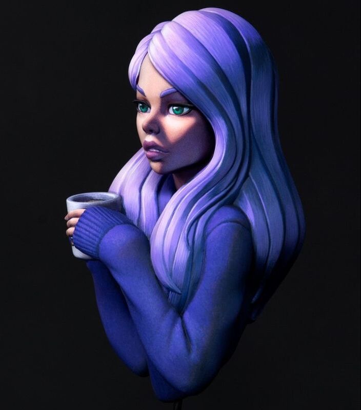
The last point that struck me about his quote was to do with spotlights. Esthel on the left is a beautiful, entirely-lit portrait. The colours of her skin are fairly consistent because the lighting doesn't change. In contrast, Cozy on the right is spotlit. Her face is towards the light and her back is in shadow. We know she is light-skinned, but the colours used are just skin tone, they are two gradients - skin tones and blues. The spotlight helps to draw attention to her face, creating a focal point, and adding a little bit more drama to the scene. (Is it obvious that I'm a Dave fan yet?) In conclusion, thinking about light in different ways - direction, intensity, colour, spotlights, environmental and ambient light - helps to create an overall scene and tell a story. It'll take a lot of practice, but I'm glad I recognise these as concepts to think about and hopefully incorporate soon. If you enjoyed the article, please do consider donating your spare change on my Linktree https://linktr.ee/junebug.minis. It helps fund my art with supplies, new minis, and upskilling. Thanks for visiting, and enjoy the art!
|